Thursday, October 27, 2016

Ashely Mejia

Ambrosius Bosschaert the Elder, 'A Still Life of Flowers in a Wan-Li Vase on a Ledge with further Flowers, Shells and a Butterfly', 1609-10
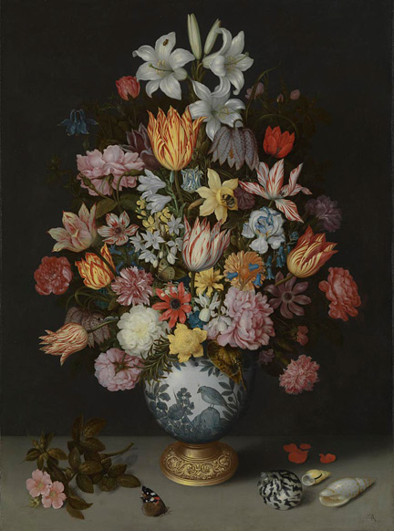
I could not find the owner of this painting but this dutch flower painting was created 1609. By the end of the 18th century flower paintings were very popular. Many artist at this time preferred to use wood panels to help support their paintings and make it look better. This is a very detailed painting with a lot of colors but although its colorful the artist managed to make it all look vintage some flowers stand out more than others.
This painting is by Willem Van Alest. I picked this because I liked the colors and how the artist silhouetted the objects onto a dark background. The flowers almost look like they are drooping at the bottom. I also see a butterfly and I like how some of the flowers are not yet blooming. I also like the red and black lady bug and the little holes on the leaves which shows the bugs were eating them. The details in this picture are precise and beautiful.

Rachel Ruysch - The Hague 1660-1750


This painting is an oil on panel painting done by a dutch painter named Rachel Ruysch. Ruysch was a famous painter in the dutch golden age of art. The colors in the flowers are nice and detailed. She was very influenced by still life paintings, mainly painting flowers. I think I could recreate this painting to look pretty similar to how Ruysch did it. Her details may be tough to duplicate but I believe the overall project will be good.

Ambrosius Bosschaert

This is a Dutch Golden Age flower painting by Ambrosius Bosschaert.  The painting was created using oil paints on a canvas.  I like how the colors of the flowers compliment each other as well as the bee at the bottom of the painting.  

Still Life with a Watch 1665 Willem van Aelst

I'm terrible at painting flowers so this assignment is going to be interesting. I chose this picture because of how dramatic the black background was with the bright red/pink flower on the right. Flowers are done often so the black is a nice spin on something that might be mundain otherwise.


Ambrosius Bosschaert, Still-Life of Flowers, 1614

       I personally found all of the the flower painting very drab and had no reason to like any of them. This one while still very boring added insects that made it stand out to me being less generic compared to all the other still life paintings. It was created by Ambrosius Bosschaert the Elder, who lived from the 18th of January 1573 to 1621.

Johan Laurentz Jensen Flower painting


Danish artist, Johan Laurentz Jensen specialized in painting flowers. His floral arrangements have decorative and symbolic value. Flowers bouquets by Jensen are usually located in a vase standing on a tray. Dark neutral background helped to emphasize the colorful tones. Roses were often the main subject. the contract between light and dark is really prominent with the red roses and brown blackish background. Jensen put a lot of detail into his dark colors, like the leafs in the back, though not noticeable till closer inspection. Also the way he was able to paint a translucent wrapping around the flowers really shows his skill in perception.   

An Opulent Flowers Still Life

AN OPULENT FLOWER STILL LIFE
I chose this painting by Georgius Jacobus Johannes van Os  because of the contrast of colors and how well they work together. The background brings out the colors that are in the flowers and doesn't make the flowers look dull. The arrangement of the flowers isn't neat and tidy. There are some flowers that are withering /drooping and flowers that still look vibrant or lively. Johannes van Os excelled at painting elegant flowers composition. Flowers the he painted were peonies, tulips,  african marigold, rhododendron and tee-tree were flowers known in the Netherlands, these flowers were highly coveted and were considered luxury items at that time.

Ambrosius Bosschaert the Elder

This was painted by Ambrosius Bosschaert the Elder, who was a still life painter of the Dutch Golden Age. He was born in Belgium and died in The Netherlands. I chose this painting because the colors really stuck out to me and it wasn't as busy as all his other paintings. I didn't like that his other paintings had so much going on and so many different colors and flowers. I like that this one is a lot simpler and it is easy to see the flowers.

Flower Still Life, 1669 by Maria van Oosterwijck

This painting was done by Maria van Oosterwijck. This is an oil on canvas painting and was done in 1669. In the painting you obviously flowers which represented the nature of human life, and you could also see a fly on the table which represents decay and the butterflies which represent resurrection or the fragility of life. I chose this painting because the dark background caught my eye because it really makes the flowers pop and stand out which makes it so beautiful. I also love how Oosterwijck incorporated the fly and butterflies, and I also love how dark the blue is on the top flower but it somehow still stands out with the black background, as well as the white and pink flowers. Look forward to painting my version of it

Still life with Flowers: Willem van Aelst


I really like this painting mainly for the color scheme and the arrangement of the flowers. The reds and whites look really nice together and remind me of Alice in Wonderland when the Queen ordered Alice to paint the roses red. With the arrangement, I like that the flowers are not directly facing the viewer, but are stretching in opposite directions from one another. There is a lot more angles to play with.

I also really like the lighting and dark shadows in the background. The focus and light is primarily on the flowers, which makes them pop a lot more. You can see the table that the flower pot is placed on, but even that is very dimly lite and shadowed. 

Dutch an Opulent Flower Still Life

This is a still life dutch flower painting by Georgius Jacobus Johannes van Os in 1782. He usually painted landscapes, but was best known for his flower paintings. I chose this painting because I enjoy the many different and bright colors used. The flowers each stand out from one another and are very detailed. I also like how the flowers are not only in the flower pot, but some have also fallen on to the table.

Wednesday, October 26, 2016

Vase of Flowers


Vase of Flowers was made by Jan Davidsz de Heem in 1645. He used oil paint for this painting. He uses realistic detail in this painting but what I found interesting is that this floral arrangement could have never existed. The flowers shown here bloom at different times of the year and would never actual be able to be arranged together.

Jacob Marrel


Jacob Marrel (ca 1613-1681) was born in Frankenthal, Germany. He became a very popular still life painter during the Dutch Golden Age. He had many flower study paintings, many were never named. I really enjoy the various colors that were used on each flower. I think it gives a lot of depth and something unique to look at. When looking at the painting, the colors are very warm and vibrant which is what drew me in. I think it is going to be interesting piece to recreate in my own style.

Flower still life


Rachel Ruysch was born in Hague, Netherlands in 1664.  Rachel was born into a wealthy and prominent Dutch Artists family. When Rachel was fifteen years old, she started learning techniques with Van Aelst. During this period, Rachel started producing various styles of still life paintings mostly flowers and woodlands paintings. This specific painting by Rachel is call Flower Still life, created in 1704, on an oil canvas. What caught my eye from this painting was the dark background that makes the flower colors more rich and vibrate. The lighting technique is what makes this painting,also the details on this is outstanding,

Ambrosius Bosschaert's Bouquet of Flowers in a Glass Vase


Ambrosius Bosschaert painted Bouquet of Flowers in a Glass Vase (or at least this particular version) in 1621 using the oil on copper painting technique. Bosschaert was born in Antwerp on January 18, 1573 and would live until sometime in 1621, when he would die in The Hague. Bosschaert painted his bouquets symmetrically and did his best to keep each flower scientifically accurate down to the smallest details. He also preferred to use the oil on copper painting technique for the majority of his works. Bosschaert was one of the first still life specialists and also started the tradition of painting flower bouquets using tulips and roses. Bosschaert managed to be highly successful throughout his career, due to a high demand for paintings of exotic flowers at the time.

Dutch Golden Age flower painting


This is a Dutch Golden Age flower painted by Ambrosius Bosschaert. He was a flower painter who had settled in the North by the beginning of the period. Many of his flower paintings are called baroque which means its usually against a dark background. I like how detailed every petal is with the shadowing. I researched on the style of his paintings and it said that they were painted symmetrically and with scientific accuracy in small dimensions and normally on copper. They also provided symbolic and religious meanings. I really liked all his paintings and it seemed like his used white, orange, red and purple paint. Overall, they're great.

Flowers and Insects


The name of this painting is called "Flowers and Insects" by Rachel Ruysch. She was a famous painter in the Dutch Golden Age of art. Her paintings are so detailed and filled with vibrant colors. She was a still life painter and is recognized as one of the best painters from this time. This painting would be interesting to recreate because of the vase and the unique flowers. Only question is I cant locate the insects in the painting.

Tuesday, October 25, 2016

Dutch Golden Age Flowers

Ambrosius Bosschaert was a still life painter of the Dutch Golden Age. He normally paints bouquets, so this painting stood out to me a lot. I enjoy the simplicity of the painting and the lack of symmetry. This painting is very different compared to the other Dutch Golden Age Flowers. My last painting was very vibrant and over the top, so I am excited to paint a more mellow picture. I plan on either zooming or cropping the painting to change it up. 

Dutch Golden Age Flower Painting


This painting is by Rachel Ruysch. She was a still-life painter from the Netherlands. She is known for basically inventing her own style; playful composition and vibrant colors. Many of her paintings include dark backgrounds and shadows. I really like that her composition is asymmetrical, unlike many other dutch golden age flower paintings. Her paintings seem to have a lot of life and movement for still-life. I chose this painting to crop and use in class because it has a variety of colors and a sense of depth. I plan on cropping it somewhere within the greenery of the arrangement.

Monday, October 24, 2016


Monkey Skull by, Armen Gasparian 1966 ~ Symbolic Painter

Gasparian was born in South America, where he studied art in George Ajrapetjana's workshop. Currently  Gasparian is living in St. Petersburg working today. His romantic images and the use of symbolism convey the nature with a delicate sense. His newer pieces are very different from older pieces. He use to work with light colors and paint and currently he is found of painting things that are tranquil and clam. Gasparian has developed his own language, combining the traditions of classical art and the new plastic form.

This painting  "Monkey skull" is an optical illusion. the composition depicts 2 monkeys sitting at a window with a boat in the background. Together they form the image of a skull.

Friday, October 21, 2016

Impression, Sunrise

Image result for Monet, "Impression: Sunrise,"
Impression, Sunrise is painted by Claude Monet in 1874. In this painting there are two small row boats and the red sun is the focal point of the picture. I like the color choices that make the sun stand out the most. Everything is dark. grey, and black while the sun has a vibrant look to it. I like the loose brush strokes that were used for the water. This is a beautiful hazy landscape painting which interestingly had a factor in giving the name of the impressionist movement.

Thursday, October 20, 2016

Vincent van Gogh's Sunflowers 1889

I chose Vincent van Gogh's painting Sunflowers because of its simplistic nature. I also liked how the background was a similar color to the focus of the piece (the flowers) yet they still stood out clearly. The background also has no detail except for the fact that it was divided into two colors, making the vase appear to be placed on a shelf. The flowers are sharp, possibly dying, yet the color of the stems are still vibrant, making great contrast between what keeps the flowers alive and the flowers themselves.

Banksy

The work I chose is a mural created by famous Graffiti artist Bansky.   I chose it because I think it presents a very real reality in the sense that following your dreams usually never works out how you want it to therefore in a sense your dreams get cancelled.


Tuesday, October 11, 2016

This One is on Me

Tuesday became the first day of the week, and I showed up to teach ceramics.  Take the week off from blogging and everyone gets credit.


Thursday, October 6, 2016

Sistine Madonna, Raphael

Image result for Sistine Madonna

This piece, by Raphael, was created in 1514. This was one of the last Madonnas and also one of the last pieces he created himself.

The colors are vibrant and go well together, which is what originally caught my attention - other than the fact that I just like artwork of the Madonna. I like how it almost looks like the people are on stage, with the curtains, and the clouds being the platform. The piece on the bottom left also makes it look like there is a scene and a stage, because it, along with the two little angels at the bottom, come out further onto a flat platform.

Doing research on this painting, I learned that the Madonna is in the middle (obviously) and holding Christ, and Saint Sixtus is on the left, pointing outward to the "faithful congregation." That would mean us, making us (the viewers) part of the artwork.

The Marriage of the Virgin by Raphael


           The Marriage of the Virgin, also known as Lo Sposalizio, this piece was commissioned by one Filippo degli Albezzini to hang in a church dedicated to Saint Francis. I chose this piece because I didn't want to talk about naked people personally but I really appreciated the atmosphere of the painting. No one seems to care that she is getting married off, maybe against her will and this maybe showing how woman were viewed as objects.

Madonna Della Seggiola


I am not entirely sure if this the original portrait, since there were several in similar or other styles. In regards to the article, I think it may be rather difficult to replicate another person's style, especially a famous painter from the past. The fact that the original artist of the painting replicated Raphael's style very well to the point that it was actually marketed off as an original Raphael painting is astonishing. There were very few distinguishes in art style between the original painter and Raphael that was noted in the painting mentioned in the article. I wonder if the original artist, since he was a renaissance painter that came after Raphael, had actually studied a bit of his art work and style in order to replicate it. 

This painting was made using oil paint on a wooden canvas in 1507 by an artist named Raphael. The painting shows Jesus Christ being carried by his disciples, as he is being let down from the cross. This painting is very iconic in Catholic religion. The people carrying Jesus seem very distraught and in mourning because of the fact that he is dead. I love the colors in the painting and the artists view of the what the background would look like.

Opinion on Raphael Post

In this article, Grosvenor discovered a painting that could have been done by Raphael for a new BBC series. The painting was bought and sold as a Raphael piece in the early 19th century. The painting was said to be copied by another artist Innocenzo, a Renaissance artist. Grosvenor did some research of his own discovering the underdrawing in the painting could not be a copy of another known work. He argued that the style of the painting is Raphaelesque. In my opinion, if the painting was bought and displayed as Raphael painting then it is a Raphael painting.

The three graces

Ashely Mejia
October 6, 2016


This is an oil painting and its called "The Three Graces". Created by the artist Raphael. The painting was created in the Renaissance in 1505. Each of these women represent something of how females change from time to time. I like this painting because it represents women in a nice way, it almost seems like if this artist appreciates women. The tone of the painting fits the theme because its a nice gentle tone that doesn't grab so much attention nor screams out any actual messages. This is a painting you really need to analyze to understand.

Raphael's La Fornarina

I chose Raphael's oil painting entitled La Fornarina. The oil painting is on wood which I found interesting because the colors are so solid and it looks as if it was on a white canvas. I think this painting is beautiful and tasteful with the contrast of the dark background enhancing her skin tone.

The Entombment

This painting was made in 1507 by Raphael using oil paint on a wooden canvas.  Theres a strong message in the piece as it shows people carrying Jesus.  Everyone appears to be in mourning especially the women as Jesus is carried off.  The colors are very vibrant along with the intensity of the scene.

La belle jardinière by Raphael


"La belle jardinière", also known as Madonna and Child with Saint John the Baptist, is a painting by the Italian High Renaissance artist Raphael in 1507. It follows the Madonna of the Goldfinch chronologically. It is currently in the Louvre Museum in Paris, France. Raphael studied the works of Leonardo da Vinci while in Florence and applied some of Leonardo's techniques to his own painting. Raphael's use of contrasting light and darks, and the relaxed, informal pose and relaxed face of the Madonna illustrates Leonardo's influence on this painting. Madonna's face served as a model of beauty for many generations. He was very popular for his many verisons of Madonna and the Christ Child.

The Rocky Mountains Bierstadt


I chose this painting because the artist described the Rocky Mountains as "the best material for an artist". The things that caught my eye the most were the sharp peeks of the mountains, and the illuminated clouds. It looks almost like mist and fog blocking the mountains. This landscape was Bierstadt's first trip to the West. He painted with vibrant colors because he believed that's how they should look. I like how even though the people and the horses are very small, the tribe is extremely detailed.

Three Graces


This painting is called "Three Graces." It is an oil painting done by Raphael in 1505. It's housed  Musée Condé of Chantilly, France. The three women in the picture depict different stages of development of women. The left is a woman before marriage ("Chastitas"), and the woman on the right is after marriage ("Voluptas"). I like how soft his painting is. The colors and lines are soft and curvy. The composition of the women is also pleasing to the eye. It draws your eye through each women, almost like telling a story. The flesh tone of the women is also highlighted which allows them to stand out from their background.

"Rain, Steam, and Speed - The Great Western Railway"


This painting named "Rain, Steam, and Speed - The Great Western Railway" by J.M.W. Turner is a very interesting painting. The contrast and blurriness of the painting makes it look better because it plays on the title. A steam train from afar you just see steam until the train is right in front of you. The painting is very abstract but yet you know what it is. Since we just worked with water color paint I feel like this had that element. .This painting was created in 1844 and is currently located in England.

The Transfiguration by Raphael


This painting is an oil paining on a wood panel. It was painted by Raphael in the year 1518-1520. He actually left the painting incomplete because he passed away, but it was finished by his assistants Giulio Romano and Giovanni Francesco Penni. The upper part of the painting portray the transfiguration if christ and the lower parts illustrates the miracle of the possessed boy and on the ground are his disciples. In the bible Jesus heals the boy to demonstrate the power of faith and prayer. I like how he made the top layer bright with a bright aroma around Christ and the lower part as darkness and the disciples look sad because they are unable to help the boy. 

"Portrait of a Young Man" by Raphael

"Portrait of a Young Man," by Raphael, is an oil canvas painting done in the early 1500s. This painting can be known as the most important painting during World War II, because it was stolen by Nazis from Poland. It is not clear whether this painting "survived" the war or not, or where the painting could be today. Also, nobody is completely sure who the man in the painting is. Although, some have a theory that it is a portrait of Raphael himself.

Opinion on Raphael and post

 Raphael seems to make his paintings seem like they took a billion years to draw. They're so detailed and actually really nice. I researched on him, and it said he started at age 11! That's a really big challenge to be compared to Michael Angelo and Leonardo Di Vinci at only age 11. I like how he had his own opinion on his painting. He didn't paint what others did and what was popular at the time. My least favorite part of his paintings are that, the faces of each all look the same.

Wednesday, October 5, 2016


Fin du travail (The End of the Working Day) by, Jules Brenton
1886-1887: oil on canvas. France

I found this painting to be inspiring. It shows french women working vigorously, with a beautiful backlit sunset. this was extremely common in the 1850s for french women to working through the day in the potato field. This painting was to portray the ideal/heroic work during the democratic revolution. the painter himself said that "art was to do the honor formerly reserved exclusively for the gods."

My Opinion on the Topic of the Article


A painting known as "The Virgin" was rediscovered recently in the National Trust's Haddo House in Scotland by a historian named Bendor Grosvenor. The painting was believed to be originally created by Innocenzo Francucci da Imola, due to the image being obscured by discolored varnish. However, new evidence has been discovered that may link the painting to Raphael. Grosvenor saw the painting, felt that it had to be a Raphael, and convinced the National Trust to allow him to conserve it. Shortly afterward, Grosvenor removed the layers of varnish and dirt from the picture and discovered the evidence that may link it to Raphael. He believes that the painting is a Raphael mainly because of the underdrawing being in Raphael's style and an alteration in one of the fingers, suggesting that it is an original work. I believe that the painting may be one of Raphael's because of the sculptural quality of the picture, the chiaroscuro techniques that Raphael borrowed from Leonardo, the full bodied figure style that Raphael borrowed from Michelangelo, and that Raphael used the same model in the painting for a number of his works, such as the "Tempi Madonna" (shown above) and "The Portrait of a Young Woman", which he painted in 1507.

Tuesday, October 4, 2016

Raphael's La Donna Velata


This portrait, La Donna Velata, by Raphael is a figment of the male artist's imagination. It is possibly Raphael's idea of beauty at the time.  Raphael transformed her into a symbol of mind, fertility, and beauty. I noticed while looking at a bunch of Rapael's portraits that the women all appear the same. They have long necks and bland facial expressions. I am not a fan of his portraits, but this one was my favorite because of her beautiful dress. I appreciate the textures of the material and his important detail while painting this portrait. All of his paintings are dark, but I like how she is highlighted off of the dark background.

"Meat", Zeng Fanzhi

    This painting Zeng is expressing his concern for modernity's problematic history. The reason this painting caught my attention is due to the amount of red he uses. In this painting it looks as if he is skinning humans. The man in the front as well is smoking a cigarette calmly like if he does not care for his surroundings. 

Zeng Fanzhi: Parcours


Zeng Fanzhi gained his recognition in the 1990s from two other paintings he did. I like this painting because it is different from the usual things that i see. there is so much detail in this and the the cracks throughout the painting make it all the more better. He paints it in a sense that it looks like an actual statue on a piece of paper. The facial expression is painting so well, you can see the great detail in the wrinkles on the face. The use of shadows is also done very well. you can see the right side of the face is much darker than the left, that is because one side gets more light than the other. Overall, this was a very nice painting to look at.

Untitled, 1994 by Zeng Fanzhiz

Chinese Contemporary Art - Zeng Fanzhi (Chinese: born 1964 in Wuhan, Hubei) is a contemporary Chinese artist based in Beijing. From the earliest stages of his career, Zeng Fanzhi's paintings have been marked by their emotional directness, the artist's intuitive psychological sense, and his carefully calibrated expressionistic technique.

I found his oil painting to be extremely intriguing. The miss conception between the body and its reflection in the mirror is skewed. the hands in this painting are also not correctly sized to the body.

Monday, October 3, 2016

"Untitled" by Zeng Fanzhi


"Untitled" by Zeng Fanzhi was painted in 1998. It is a color lithograph. This piece of art was a part of his mask series. I read that his art was mainly based of the alienation and psychological torment inherent to modern life. This figure intrigued me because he is just laying out in a bed of flowers, by himself, day dreaming. I feel like the colors are so bright and I like how the color of the sky is the same as some of the flowers, which in my opinion brings the painting together. The mask seems very expressionistic and in an exaggerated style.

"Andy Warhol's Photoshoot"

This panting is by Zeng Fanzhi and it is called "Andy Warhol's Photoshoot".  The painting is an oil painting on a canvas that was created in 2004 and sold for auction at Christie's in New York.  I liked how Zeng paid tribute to Andy Warhol by painting a picture of him taking a photo.  I like the work itself because it they look like real humans while remaining cartoony.

Zeng Fanzhi: "Praying Hands"


This is an oil painting done on a canvas by Zeng Fanzhi called Praying Hands. Fanzhi was inspired to do this painting by artist lambert Durer, a german painter. Fangzhis work is actually just his version of Durer’s Study Of The Hands Of An Apostle. Duper was a sibling of 17, and him and his brother were both interests in art but the daily could only afford tossed one to art school so Durer’s brother stayed home, and Durer was forever in his brothers debt. His brother had to work in the mimes where h worked for so long that he eventually got arthritis making it impossible to become a painter like Durer. First look at the painting and the name of it I thought it had to do something with God or something but not exactly, although it was kind of religious based on the name of the piece. I really liked this painting because of the colors he used and how he made the light from the candles reflect on the hands and how there are specks of red on random spots. 

Zeng Fanzhi's "Yet To be Titled"


"Yet to be Titled" drew my attention because of the twisted landscape it depicted, the various shades of red, and, of course, the lack of a proper title. The picture was painted using oil paints on a canvas back in 2013, but Fanzhi apparently never gave it a proper name. The landscape drew my attention because of the shades of black and green used to create the forest gave it a wild, overgrown look, despite the precise, smooth strokes used to create the up close branches. The various shades of red drew my attention because of how ominous they made the sky look while also drawing your attention to the lower half of the canvas. Overall, this picture gave me one of those horror story feelings, but I still found it to be enjoyable.

Mid Term Slides